Model Results - Comparison with v8.3.1
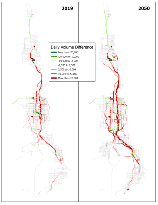
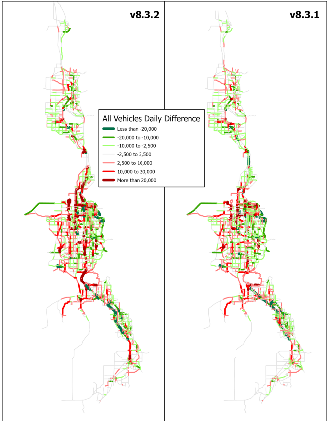
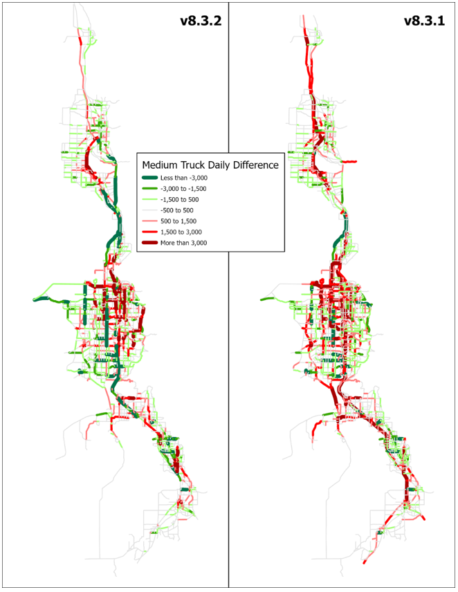
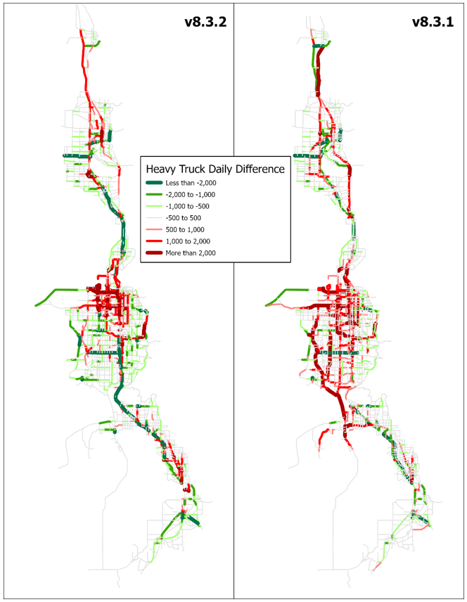
Figure 1 shows a comparison of daily roadway volume in the v8.3.2 model compared to the v8.3.1 model. Roadway links in red demonstrate an increase in traffic and green show a decrease in traffic between the new and the old model. The thicker the line and darker the color, the greater the magnitude of change. At the region level, the changes show that v.8.3.2 includes greater county-to-county flows as demonstrated in the 2019 base year with volume between Salt Lake County and both Davis and Utah Counties increasing while roadways such as I-80, I-215, and SR-201 showing decreasing traffic. This pattern is continued in the 2050 model with the intensity of change increasing on north/south freeways and arterials.
Comparison of the highway volume validations of the v8.3.2 and v8.3.1 models are shown in Figure 2. There are separate charts by facility type and by county, as well as vehicle type. Medium and heavy truck trip generations and trip-length-frequencies were adjusted in the calibration process to bring model truck volumes closer in line with observed. Overall, for all vehicles the v8.3.2 model is closer to observed with all facility types within 4% of observed. Utah County improves significantly to only 1% low while Box Elder, Weber, and Davis counties are a couple percent lower than v8.3.1. When looked at by facility type, medium and heavy trucks see major improvements with minor arterials and major collectors and are much closer to observed by significant margins, but overall are slightly lower than observed as compared to v8.3.1.
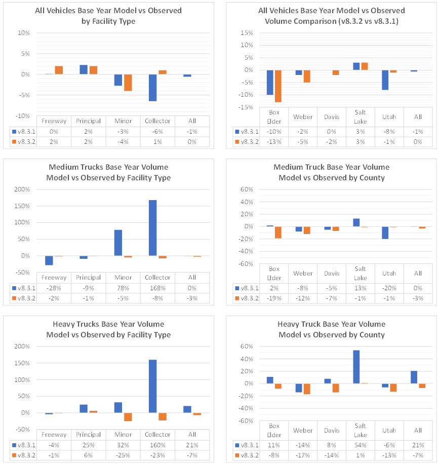
Figure 3, Figure 4, and Figure 5 show a comparison between daily model volumes by vehicle type with observed traffic volumes. There are slight changes in the All Vehicles figures between v8.3.2 and v8.3.1. Greater improvements are seen in the Medium and Heavy Truck figures, especially in the Box Elder and the Mountain View Corridor areas.
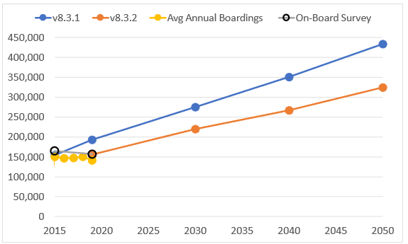
Transit ridership between v8.3.1 and v8.3.1 were compared at the trips, boardings, and mode share levels. Figure 6 and Figure 7 show a comparison of daily transit ridership and boardings for both the v8.3.2 and the v8.3.1 models. The v8.3.1 and v8.3.2 model transit was calibrated to the UTA On-Board Survey for 2015 and 2019, respectively, so the ridership for each of those models falls right on the OBS target. The boardings for the model are estimated but are close to average annual boardings as reported by UTA. Boardings between 2015 and 2019 have been relatively flat. The increase to 2050 is based on increased transit attractiveness and more supportive land use as built into the model.
![]()
Share by transit mode is shown in Figure 8 and Figure 9 for v8.3.2 and v8.3.1, respectively. In v8.3.2, Core Bus routes (Mode 5) show a greater portion of trips in v8.3.2 than in v8.3.1. These additional trips come mostly from Light Rail, which actually sees a decrease in mode share in 2030. Commuter Rail shares remain relatively consistent, as well as BRT.
![]()
![]()
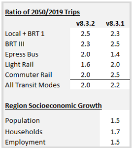
Even though the transit ridership forecasts are lower by 23% in v8.3.2 compared to v8.3.1, the 2019 to 2050 ratios for each model are similar with 2.0 in v8.3.2 and 2.2 in v8.3.1.
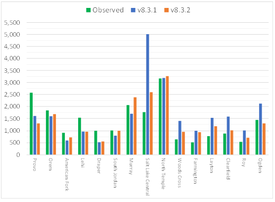
As mentioned in a previous section, county-level adjustments were made in Davis and Utah counties to help better align station boardings in the model with observed. The comparison of the models with observed is shown in Figure 11. Due to these adjustments, there is a slight increase in Utah County boardings. However, Provo Station decreased slightly to just over half of what is observed. Davis County boardings proved to be more sensitive to the adjustment and a significant decrease is shown but still higher than observed boardings.